We forget that Google’s logo is really bad because we’ve been looking at it for so long that we don’t notice any more. But I’m pretty sure that even 10 years from now I’ll still look at Yahoo’s new logo think “That’s one godawful fugly logo right there.”
It’s a serious case of “A camel is a horse designed by committee.”
It looks like a logo that somebody would have created with clipart fonts from those CDs back in the early nineties. It lacks any personality, it’s boring, it’s banal. It’s a great big bag of fail. It sucks, badly.
I never thought a logo could be so singularly uninspiring.
On the upside, it’s definitely got people talking.
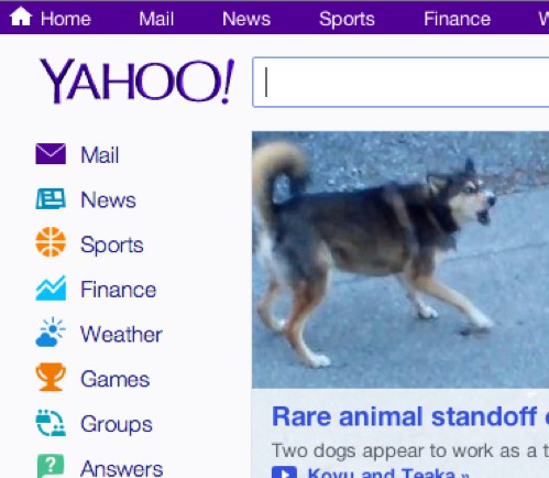
Update: It actually doesn’t look nearly as bad on the Yahoo website, although at best I give it a “meh.”