
We forget that Google’s logo is really bad because we’ve been looking at it for so long that we don’t notice any more. But I’m pretty sure that even 10 years from now I’ll still look at Yahoo’s new logo think “That’s one godawful fugly logo right there.”
It’s a serious case of “A camel is a horse designed by committee.”
It looks like a logo that somebody would have created with clipart fonts from those CDs back in the early nineties. It lacks any personality, it’s boring, it’s banal. It’s a great big bag of fail. It sucks, badly.
I never thought a logo could be so singularly uninspiring.
On the upside, it’s definitely got people talking.
Update: It actually doesn’t look nearly as bad on the Yahoo website, although at best I give it a “meh.”

A/B testing yields interesting results…
But wait! They have this awesome animation http://www.yahoo.com/
Someone with a site that looks like this still feels entitled to make comments about other logos!
I love my logo.
Arrington’s logo is great, especially considering it wasn’t designed by a multinational corporation that has an instantly recognisable brand.
Well, I guess you get what you pay for …
Reblogged this on Gabbie cbg.
They should have had an open contest and picked a winner. This would have given them a ton of press + buzz within designer/technical circles while making a statement that they are changing. I am not a fan of the new logo but it is somewhat genius for branding purposes since anyone can type out the brand without much effort or special font. I imagine news stories will type out YAHoO! rather than YAHOO! when writing an article.
In the design community, logo contests are a joke, a publicity stunt on par with hiring Lady Gaga as your creative director. It may have given them some PR, but not a worthwhile logo. One example: http://www.brandinsightblog.com/2009/11/21/a-bad-idea-for-brands-the-logo-contest/
Well 30 days of logos was somewhat of a publicity stunt. If an iconic online company like YAHoO! were to do a contest I guarantee every designer who thinks contest are a joke would jump on the opportunity just because it wouldn’t take much effort to submit something. Do you believe the current logo is worthwhile?
Have to wait and see. When they say they redesigned their logo, what they mean is that they redesigned their brand. The logo is just the part that’s easiest to explain to the public. Even a bad logo (ahem, Google) wouldn’t necessarily doom the effort. Since brand design requires a lot more work—think of how much work it takes to design a whole car vs. draw a picture of it—no; no respectable design firm would submit an entry, just like in past high-profile contests.
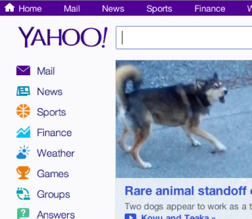
Breaking news on Yahoo.com, “Rare animal standoff”
Experiment complete. Science has determined it impossible that their logo reduce the headache caused by their homepage. 😉
They should drop the purple.
If this is the only thing a multi-billion dollar corporation can come up with, what hope do the rest of us have?
Smokescreen. Here’s the REAL logo:
agreed.
I don’t really care what their logo looks like…I just wish they would turn back the clock on the alpha-testing-level new interface for Yahoo Groups that they have randomly started inflicting upon users…with no notice, no details, nothing… Just go searching for “yahoo neo” and you’ll see what I mean.